Overview
Company
Alibaba Travels
31
Stakeholders
Timeline
2022-2023
3000+
users
The product
Hotel is one of the 13 products on Alibaba.ir, the largest online travel agency in Iran with more than 1200 employees. The goal of this product was to simplify the process of booking hotel rooms from the comfort of people’s digital devices.
The team
Parmida Aria (product designer), Bahere Hamraz (product manager), Parvane Rajabi (UX researcher), Amir Hossein Mehrabi (tech lead), and Mahdi Karimi (front-end)
How it was
In high-demand seasons and holidays, in popular travel destinations in Iran like Kish and Mashhad, Iranian hotels define some restrictions on booking dates to maximize their revenue. They can define 3 different restrictions:
1
Minimum nights
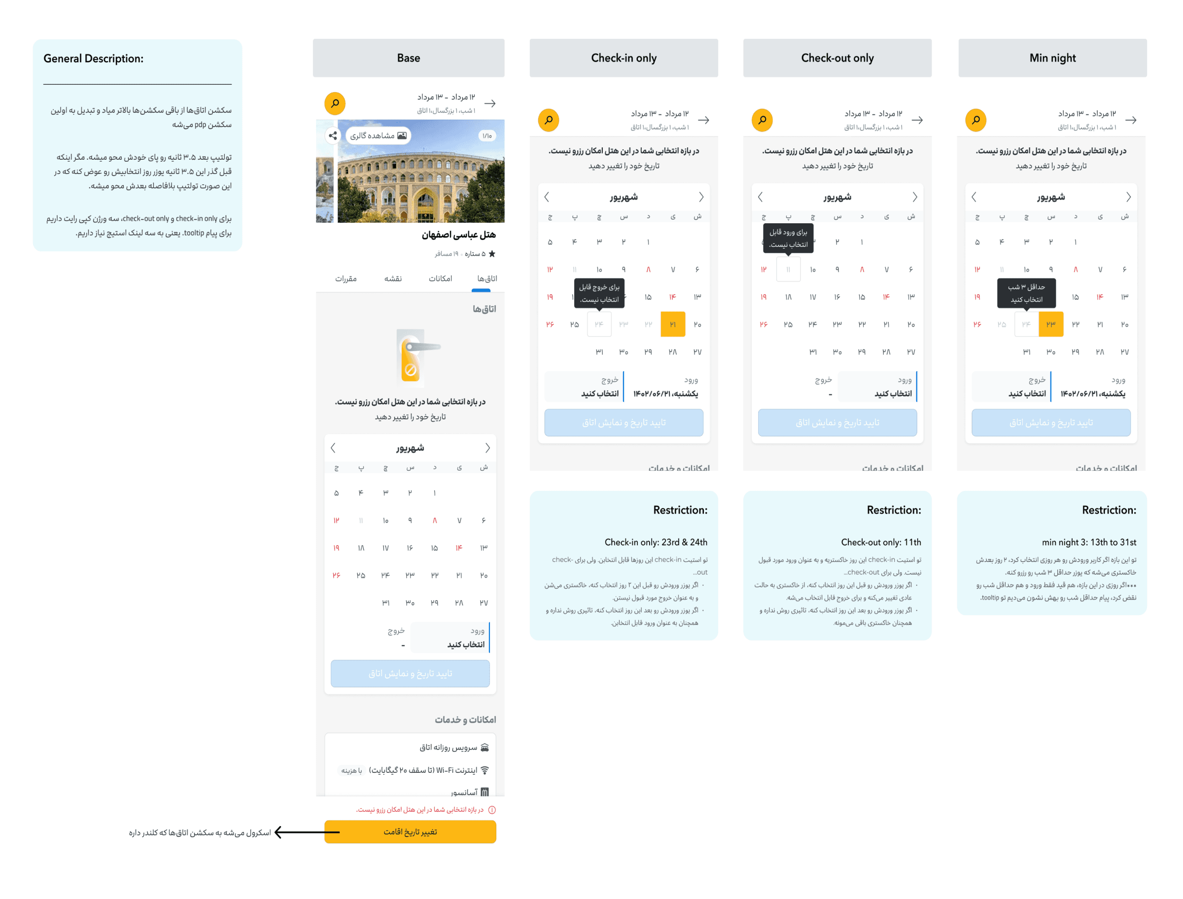
This means you have to stay for a certain number of nights or more to book a room. For example, if a hotel sets a "2 minimum nights" rule, you must book for at least two nights, and the hotel wouldn't allow you to book just for one night.
2
Check-in only
If the hotel selects April 10 as a "check-in only" date, you can't check out on April 10. You can either check in on that date, or it can be the middle day of your stay.
3
check-out only
As an example, if a hotel picks April 15 as a "check-out only" date, you can't check in on April 15, but you can check out. It's like a train station that doesn't allow boarding at a particular time, but you can get off.
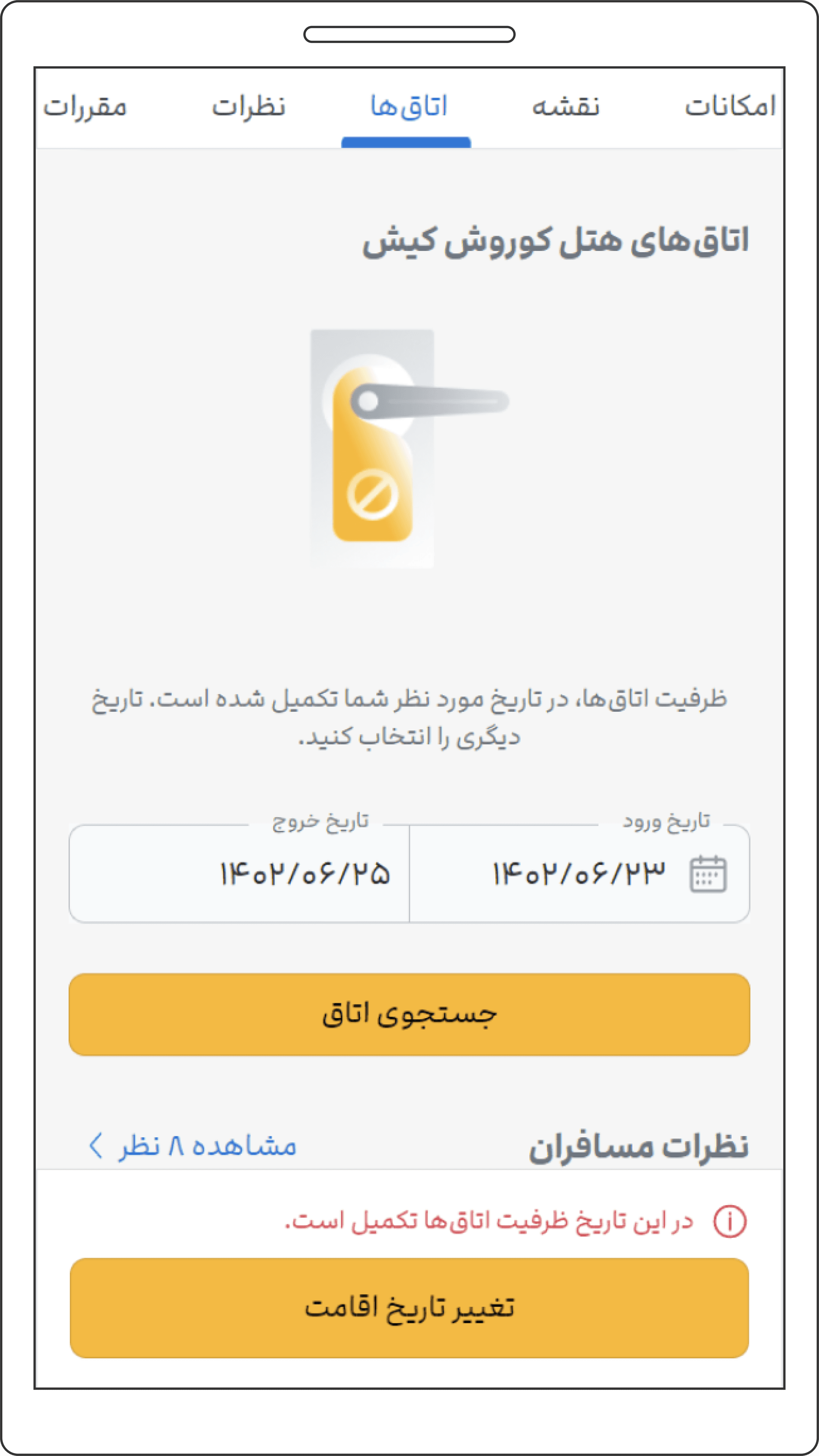
Users would pick their desired dates, pick a hotel and land on PDP. However, when the dates don’t satisfy the hotel booking restrictions mentioned above, they encounter an ERP telling that they should change dates without any more explanation.
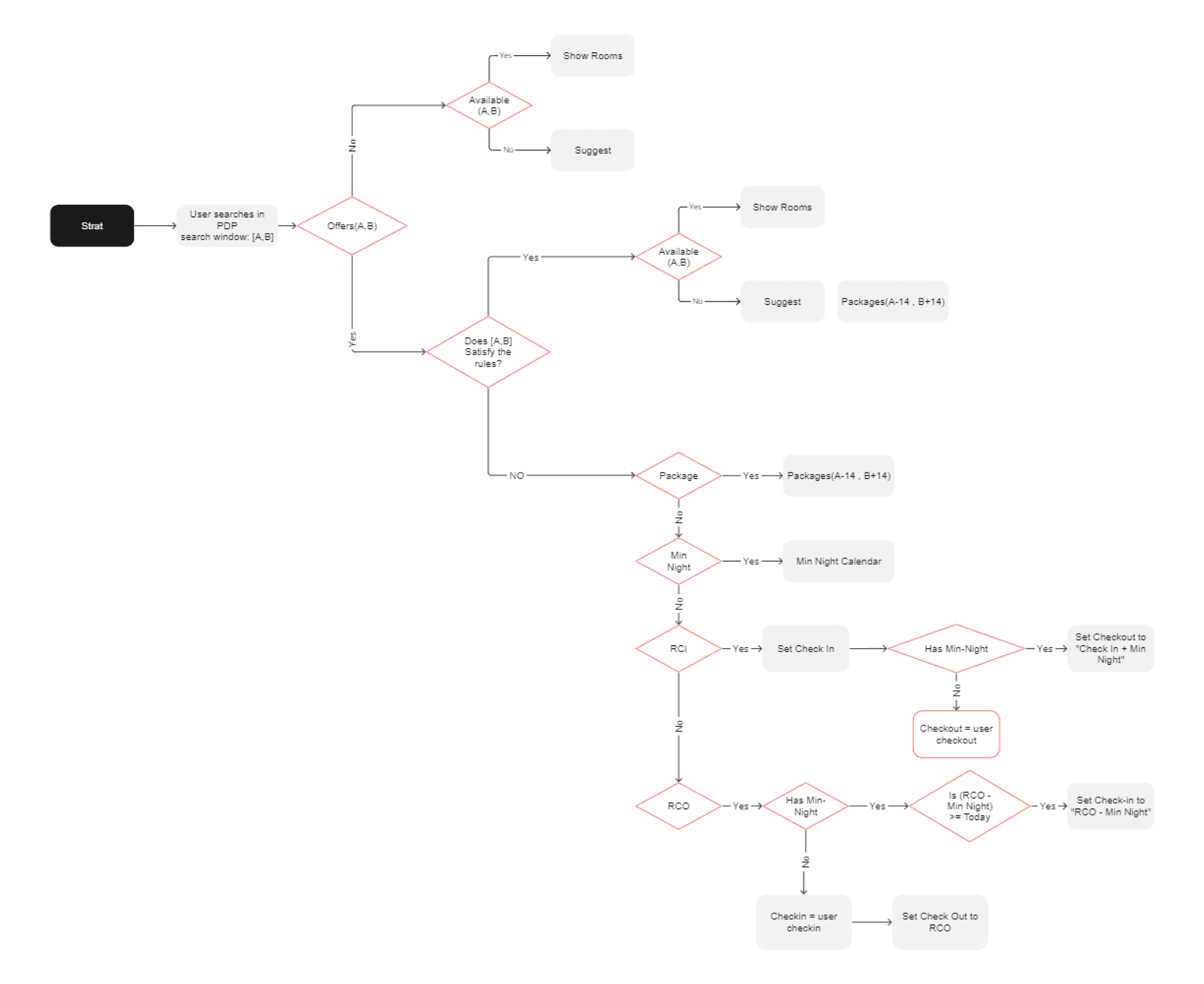
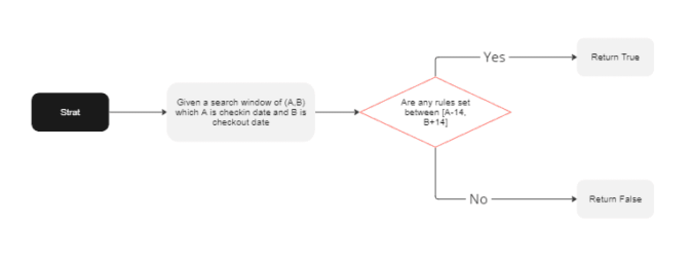
This diagram shows how we handled displaying ERP caused by restrictions in PDP:
check Availability
Offers
the problem
69%
31%
Other
cities
Popular travel cities share of orders
Popular
cities
Percentage of restrictions in popular travel cities
Potential monthly profit lost
More than $100K
Restricted CR vs unrestricted CR for the same hotels and same periods of time
Hotels with the booking restrictions explained above often caused an "empty result page" (ERP). When faced with an ERP, only about 12% of users adjusted their dates. Our initial usability test showed that many users incorrectly believed we had no available rooms on their chosen dates. In reality, however, their dates simply didn't meet the hotel's policies. This misunderstanding led to...
1
An 88% abandonment rate
2
A 75% drop in conversion rate compared to unrestricted hotels
3
Users being frustrated with booking and switching to other travel agencies
4
A 105,795$ potential monthly drop in sales
Based on the above data and the usability tests we did, the way we handled these restrictions was complex and not user-friendly.
Users figure out what to do when they encounter a rule, find an available room, and successfully book it.
The goal
1
Provide immediate feedback when users select dates that don’t satisfy restrictions.
2
Offer clear guidance on date selection that aligns with hotel policies.
3
Minimise or eliminate presenting users with ERPs (empty result pages).
4
Minimise or eliminate errors during the booking process with restricted hotels.
Starting the design
Ideation
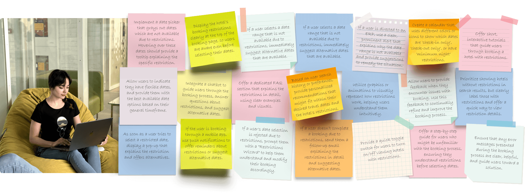
I started with brainstorming ideas.
The first drafts
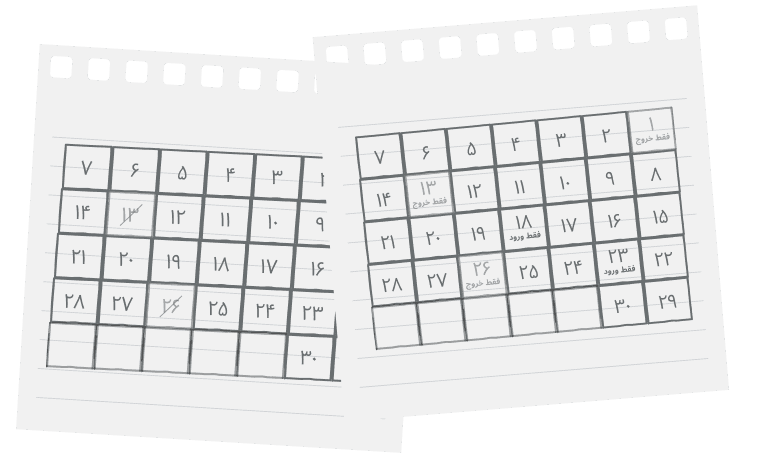
Now it’s time to select the ideas that make more sense and design those wireframes. We first tested out some initial ideas on paper wireframes with stakeholders.
Then, I moved to digital wireframes with refinements based on feedback. We already had an established design system, so we could skip the lo-fi wireframes and create mid-fi ones really fast.
About 85% of our organic traffic was from mobile devices, so we focused on the mobile view of the website to have a better impact.
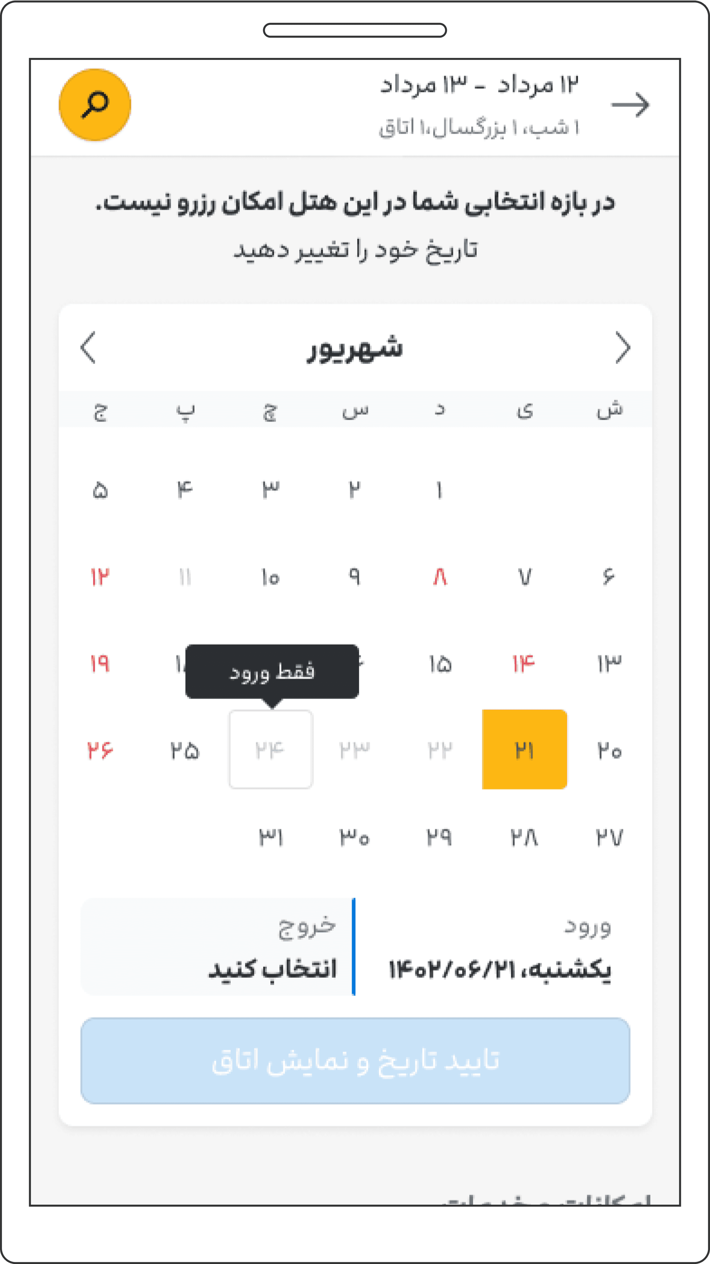
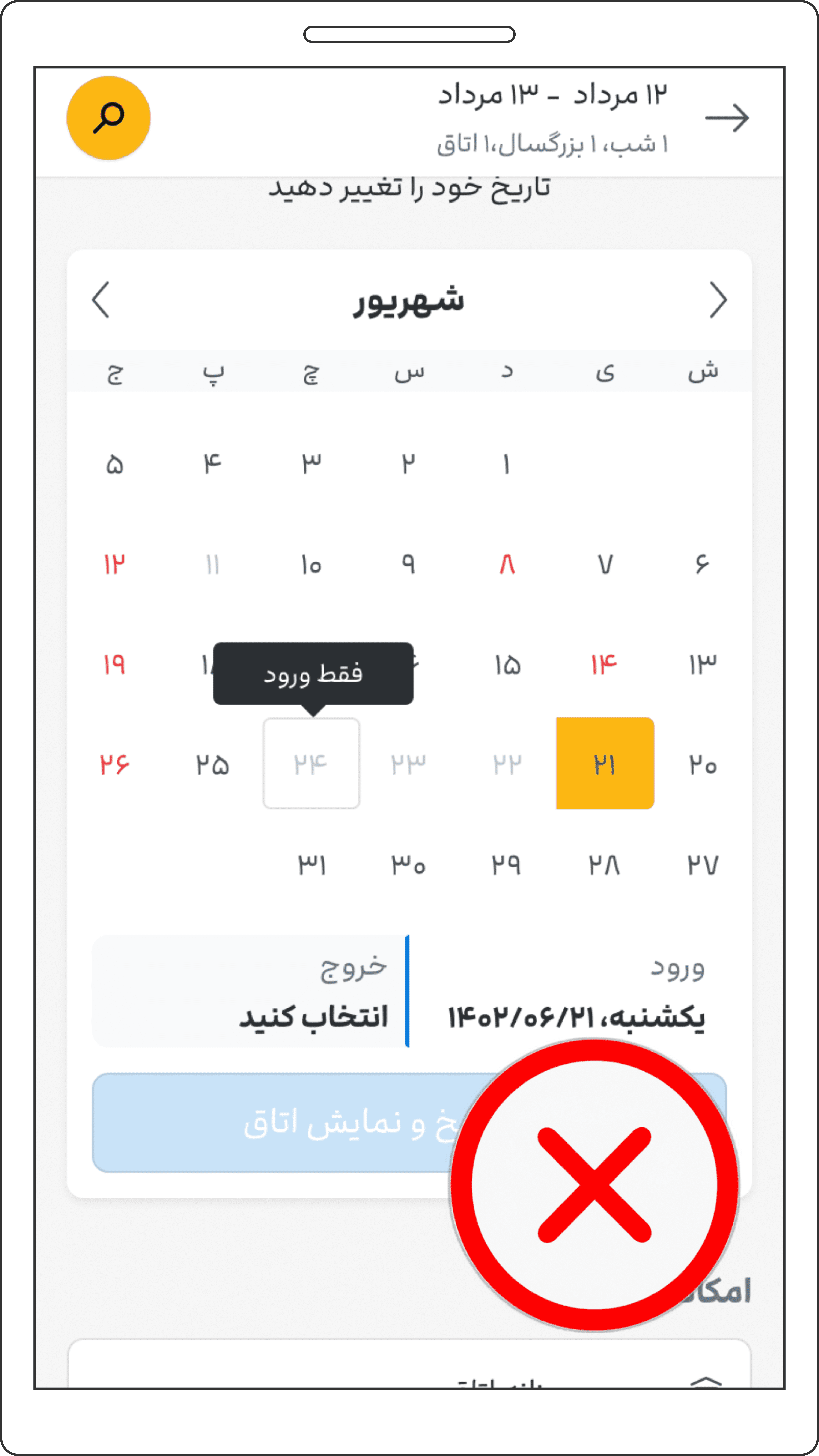
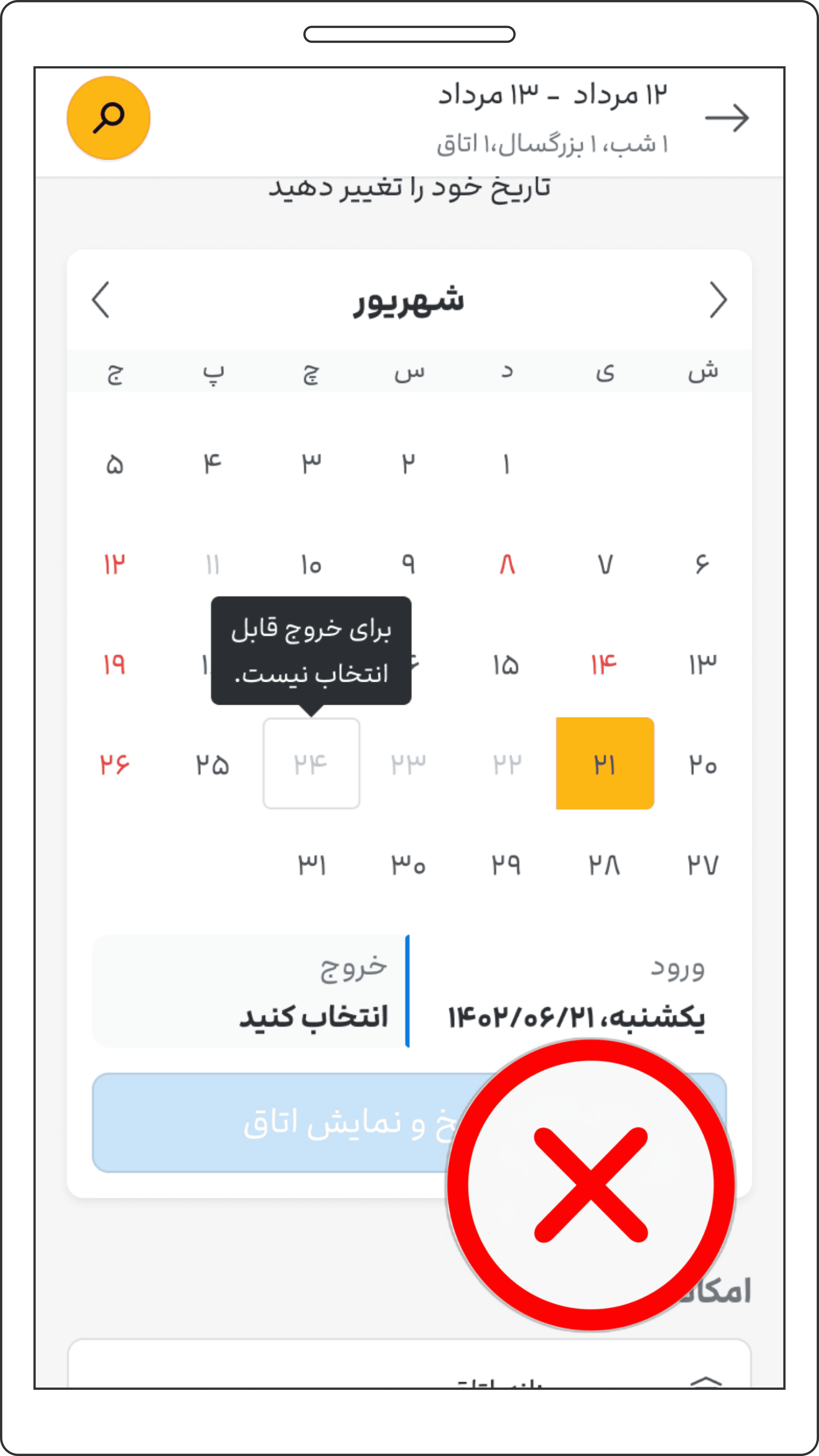
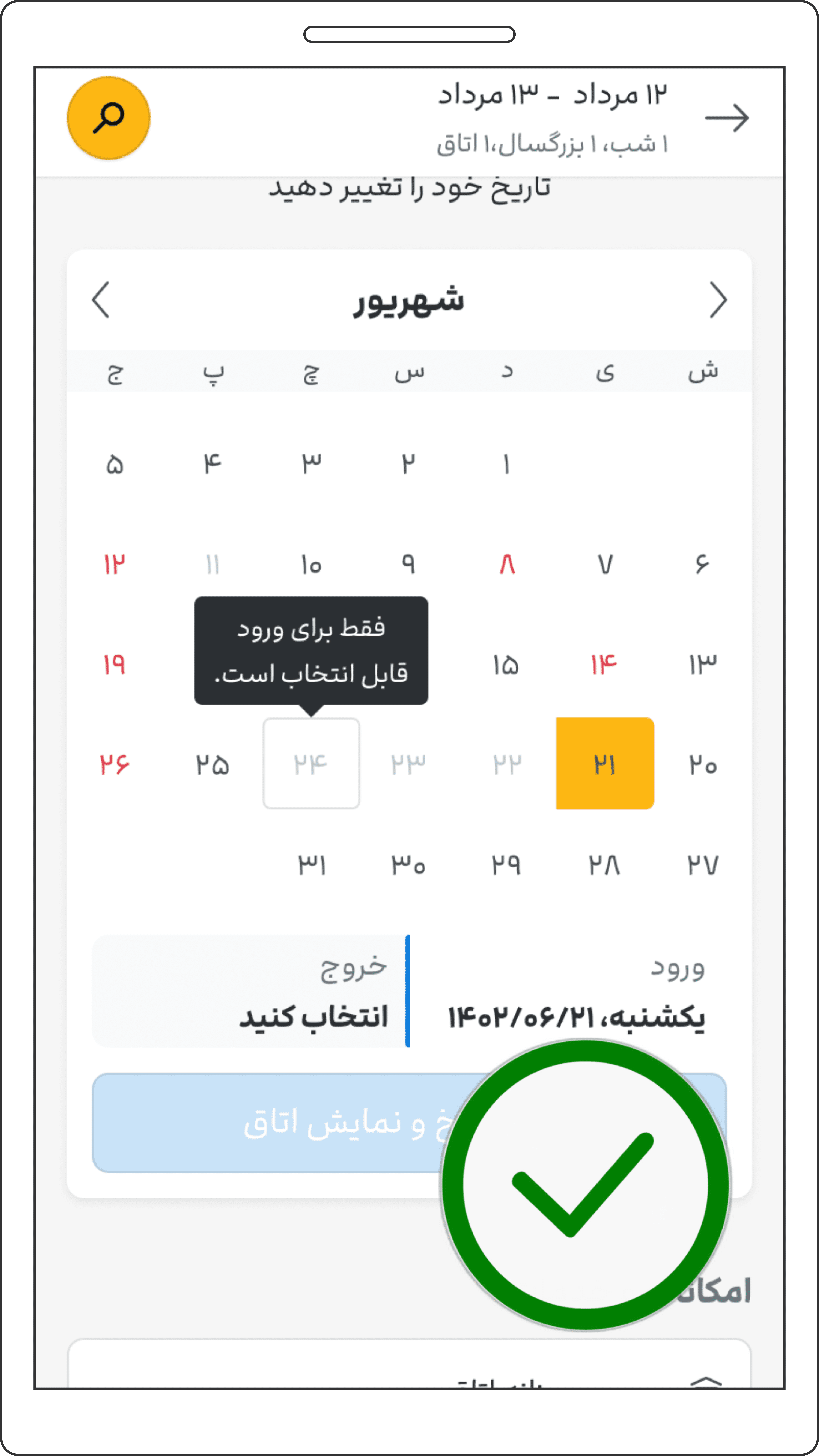
I suggested displaying all restrictions on one calendar, avoiding an empty result page with the general explanation that "the selected date isn't accepted by the hotel." Instead, when users pick a restricted date, a tooltip (a brief pop-up) would appear directly above, informing them of the issue. The user would have to fix the issue to be able to search for rooms or pick another hotel. This way, users can't proceed with incorrect dates and are prompted to read the notice, preventing confusion later. The message for the minimum nights rule would say “at least x nights”. However, crafting the right message for check-out only and check-in only was challenging. For example, if a user picks June 27 for check-in and it's a "check-out only" day, we had three ideas for what that message might say:
1
"Check-out only"
Good: It's short and to the point. Not so good: Users might wonder why we're talking about checking out when they're trying to pick a check-in date.
2
"Only selectable for check-out"
Good: This might be clearer for some people. Not so good: It might still be confusing since they're trying to pick a check-in date.
3
"Not selectable for check in"
Good: It clearly says what they can't do. Not so good: It doesn't say that they’re allowed to check out on that date.
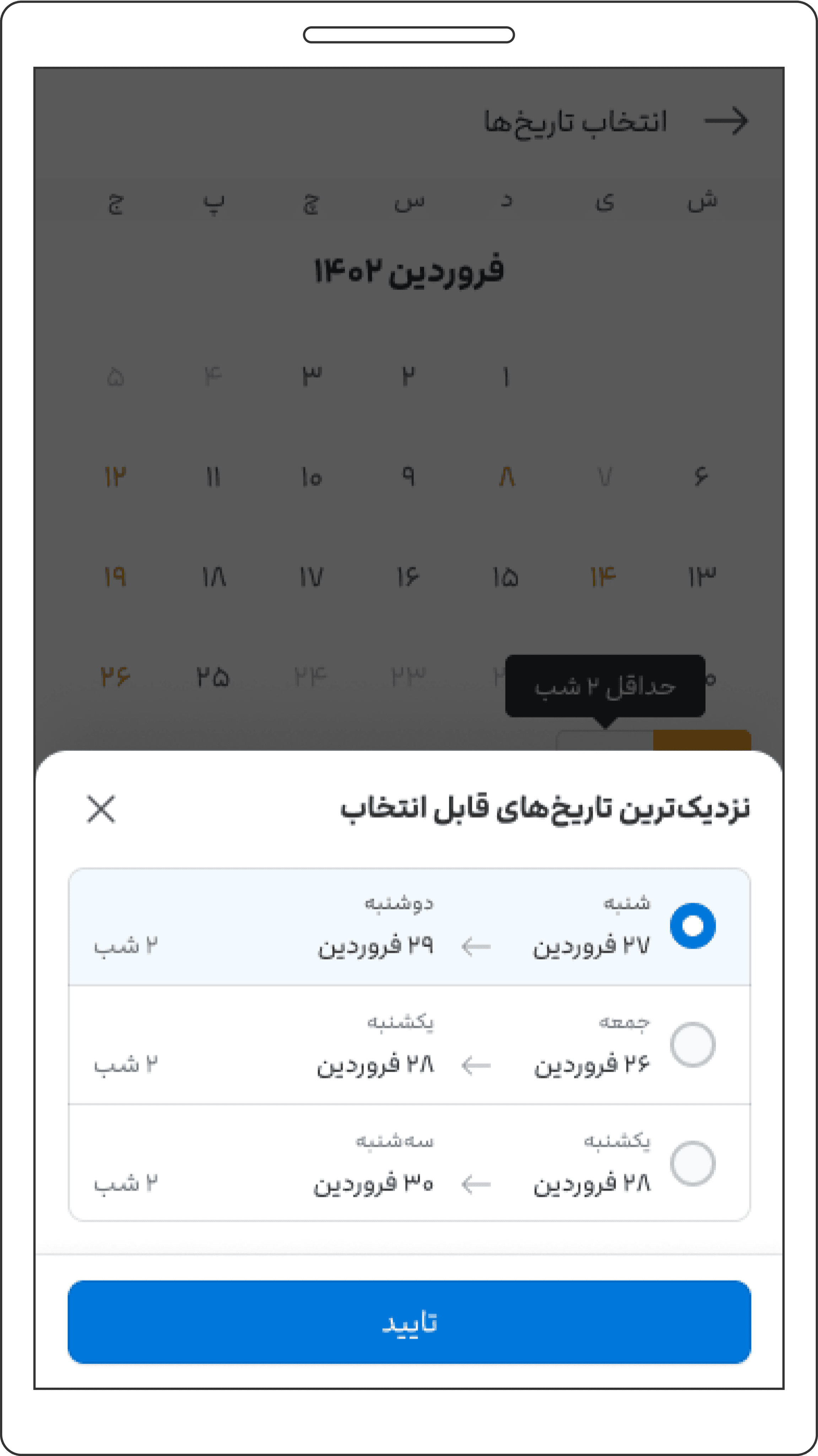
I also came up with the idea to suggest other nearby dates if the hotel has certain rules. Like, if someone wants to stay for just one night but the hotel says they have to stay for two nights, we'd show them the next best dates to pick.
Immediate feedback via tooltips
Nearest available dates suggestions
Test
After hearing from our team and making some changes, we checked which message was more relevant to the users through a survey and a cloze test. Over 2,000 people answered. Over 70% understood the message "Not selectable for check-out" the most. We then did a usability test to see if people knew what to do when they saw these rules. Of the 7 people we tested, 5 could modify their dates slightly and finish booking successfully.
“check-in only”
“Not selectable for check-out”
“Only selectable for check-in”
However, suggesting the nearest available dates didn’t do well in the test. Mostly, users were fine without it, and even when they went for it, it confused them more than playing with the calendar a little themselves. So I decided to say goodbye to that part of my design for the sake of the users.
Refining design
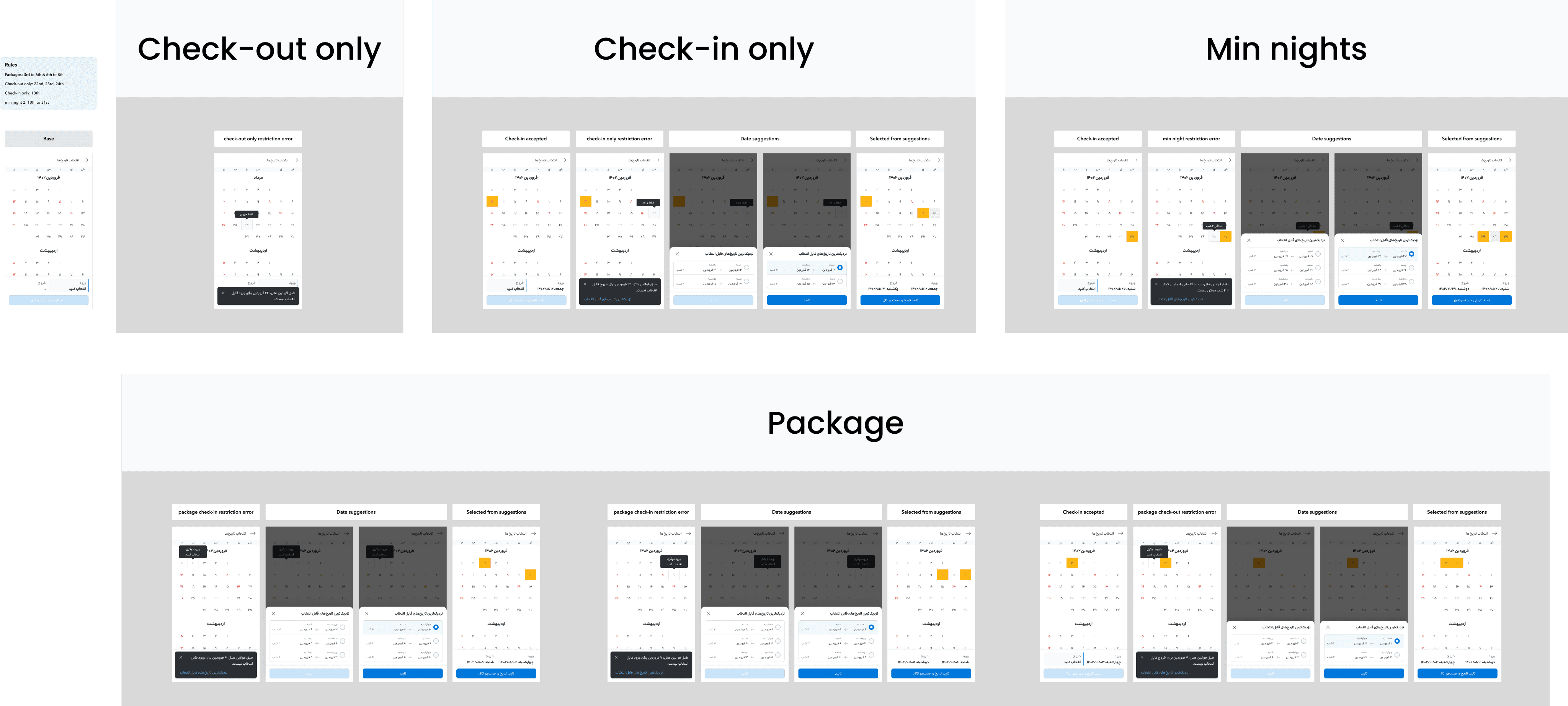
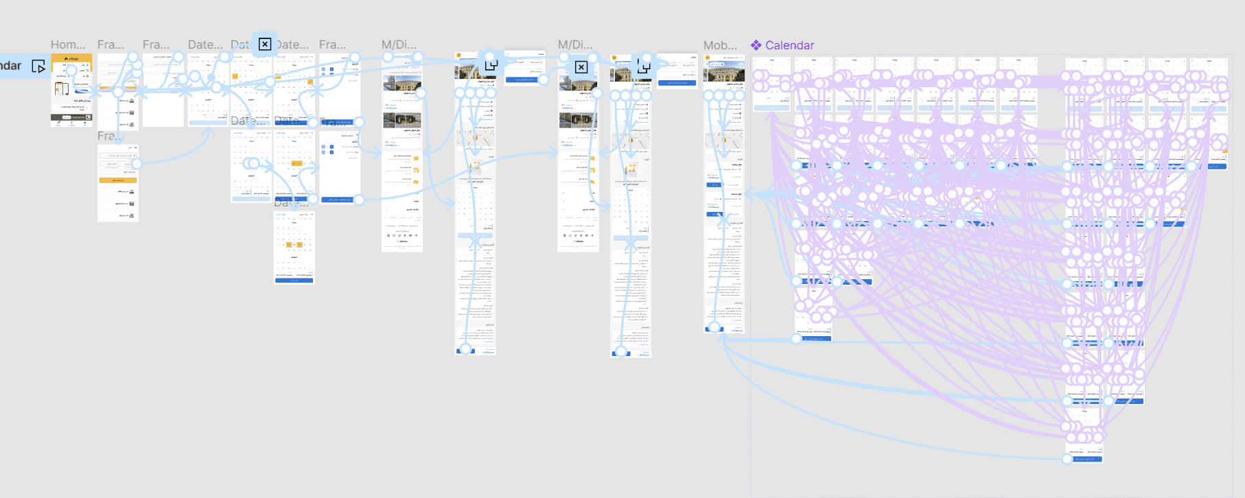
I first outlined a flow that was improved based on the survey and usability test findings.
Then it was time for hi-fi mockups, prototyping, and handoff.
The Result
After the final test on the actual website, the new design outperformed the previous one. With increased conversion rates and decreased abandonment, the loss in potential monthly sales is significantly minimized, reducing it from $105,000 to around $60,000.
Reduced Abandonment Rate
Clearer instructions and immediate feedback help users understand what they need to do, reducing the chances of them leaving out of frustration.
Conversion rate improvement
By clarifying restrictions and making the booking process more user-friendly, users are less likely to abandon the process, resulting in a higher conversion rate.
date adjustment increase
Increase in the number of users adjusting their dates from 12% to around 30%:
rise in average time on page
Instead of users quickly leaving the page due to confusion or ERPs, they spend more time navigating, understanding the rules, and making bookings. ToP was risen by 13%.

