Overview
Company
Khanoumi
22
Stakeholders
Timeline
2022
100,000+
users
The product
Khanoumi is Iran's leading cosmetics e-commerce platform that provides a selection of high-quality beauty products.
the project
Khanoumi wanted a redesign. They knew the previous website had low usability, poor conversion, and an outdated visual look, and they wanted a new, more efficient website to replace the old one. That’s where I came in.
I was the only designer in the entire company, surrounded by multiple product managers and developers who were eagerly waiting to develop based on design references. There was no existing design system or UI kit, and the website was never designed using UI/UX practices and data.
My role
UI/UX designer leading the responsive website redesign from conception to delivery.
The team
Parmida Aria (UI/UX designer), Saeid Sisakhti (PM), Mehrdad Khoddami, Nima Rahimian (PM), Ali Javid (PM), Omid Bakhshi (Front-end)
Why Redesign?
We conducted research (heuristic analysis, interviews, surveys, etc.) to evaluate the original website and its main features. We analyzed the data and identified the following problems:
Inconsistency across the website
The website's interface was disjointed and confusing due to its inconsistent use of colors, font styles, UI components, and writing styles.
Outdated and unappealing design
The website's visual design was created when memes were just cat pictures and has not aged well. As a result, our interface feels out of date and stale, undermining the credibility and professionalism of our brand.
Poor usability performance
Recent usability tests revealed that the design was poorly done. Users found it more difficult to navigate and complete tasks than the Titanic navigating an iceberg field, leading to frustration and a low conversion rate.
Project Goals
a cohesive system for UI design
Consistency in colors, fonts, UI components, and writing styles is crucial for an intuitive user experience and a visually appealing website.
Redesign the visual design
The redesign aims to enhance the website's functionality, visual appeal, and brand credibility while preserving its professionalism.
Improve usability performance
The goal was to conduct thorough usability tests to identify and rectify any issues, thereby enhancing the design's usability and minimizing user frustration.
Bump up conversion rates
Improve conversion rates by simplifying the checkout process, lowering cart abandonment, and redesigning product detail pages.
Cohesive RTL UI System
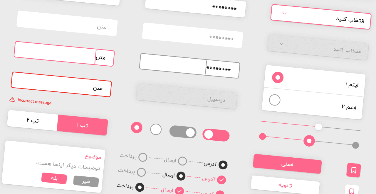
I analyzed our website's design and identified areas for improvement in order to create a more cohesive and intuitive user experience. For consistency, I created a style guide outlining UI elements and incorporated existing design patterns that users were familiar with.
I then developed wireframes and prototypes, tested them with users, and iterated on the design in response to their feedback.The result? A visually appealing website with a consistent UI design system that provides an enjoyable user experience
Better Usability
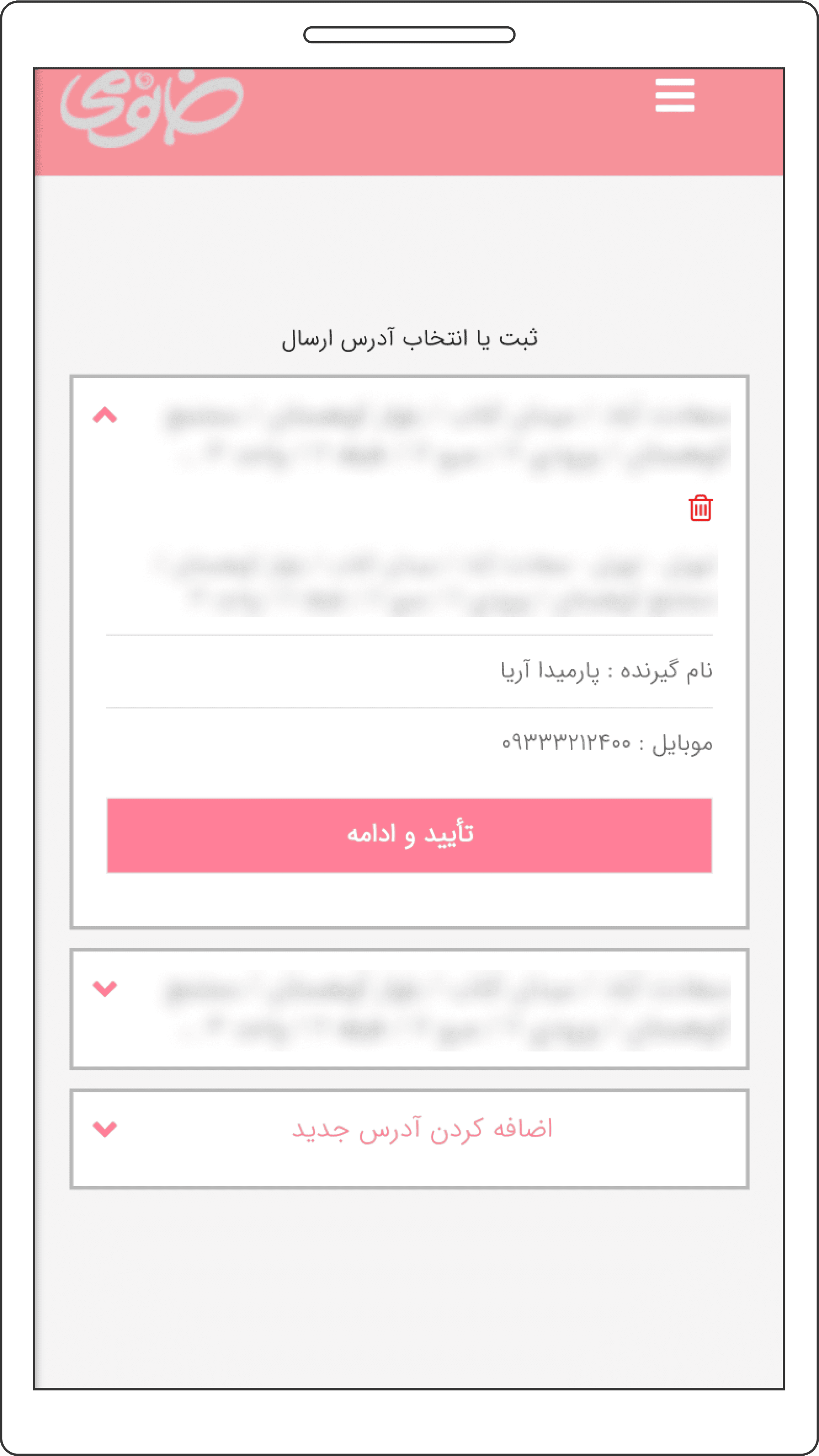
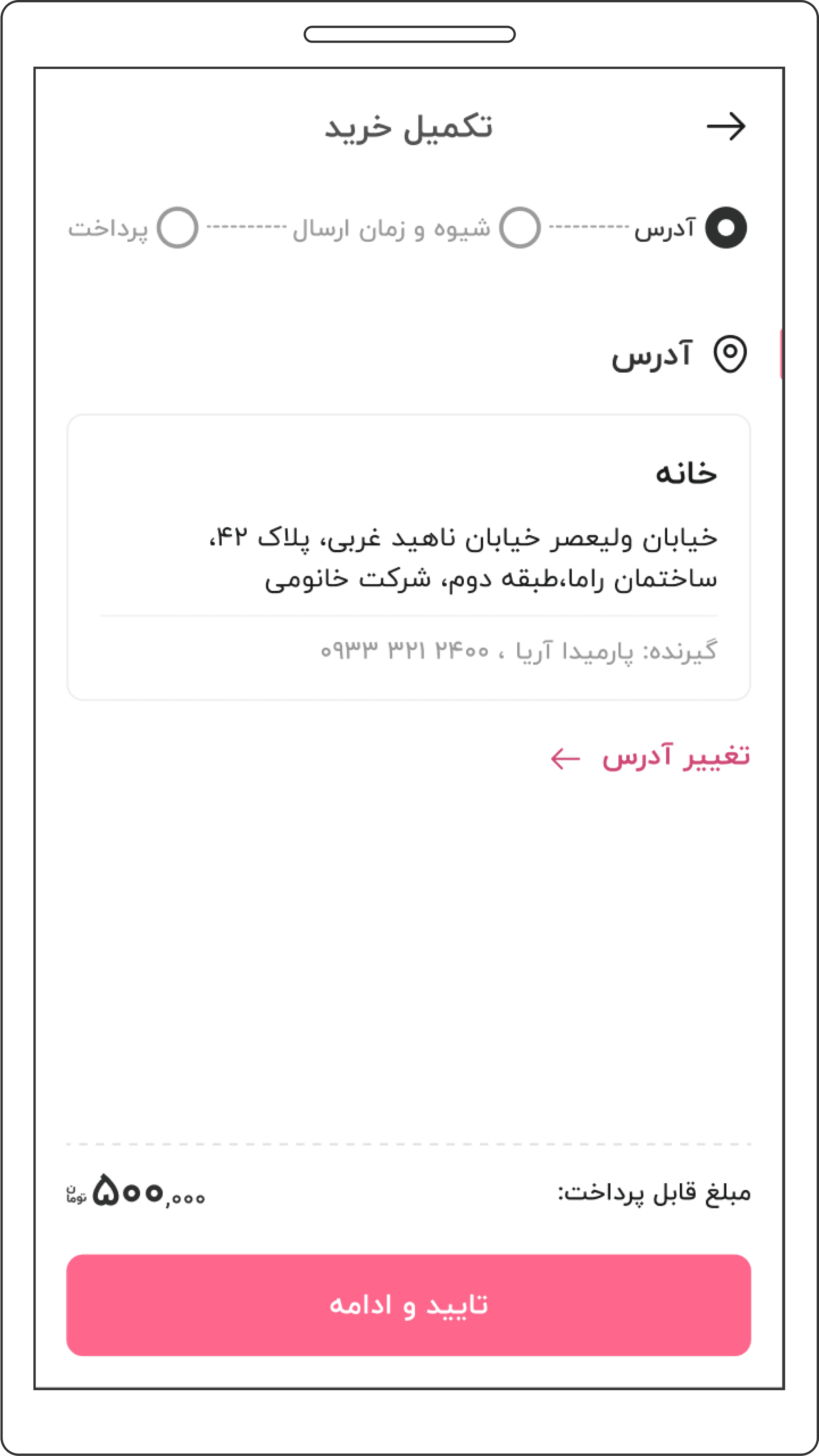
Next, we focused on usability. I conducted extensive tests to identify and address user issues in order to improve the website's usability. I optimized the design for ease of use and reduced user frustration based on feedback from these tests. I made sure, for example, that the checkout process was simple and straightforward and that users could easily access their profile and purchase history.
Before
After
The Result
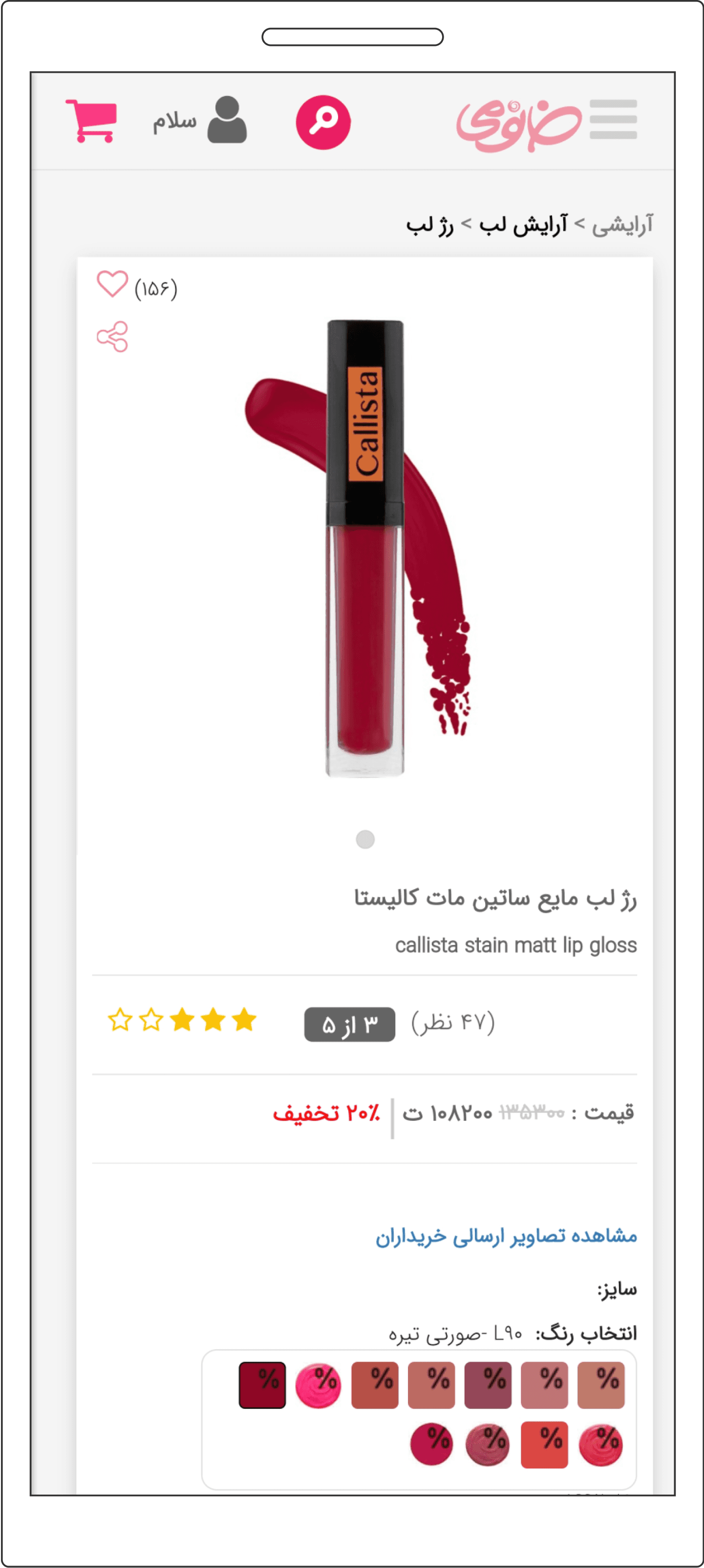
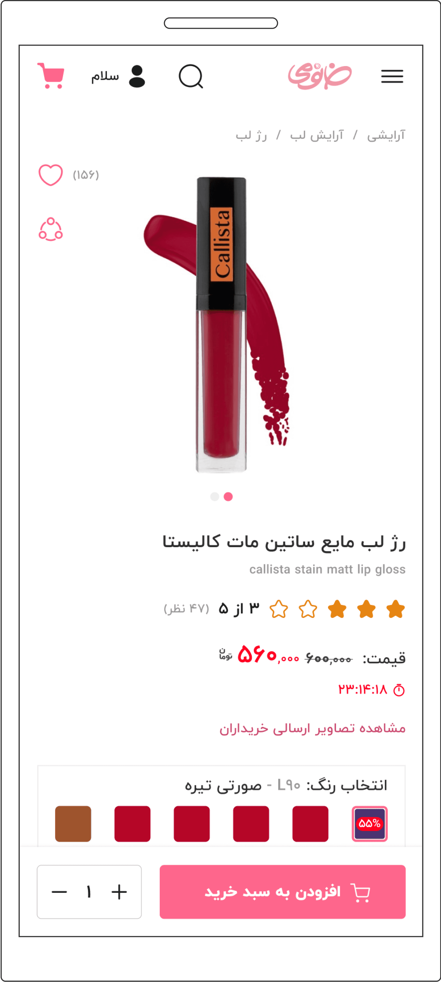
We transformed our website into a sleek and attractive platform that provides a superior user experience after my redesign, and with the enhanced usability, it's a breeze for users to navigate and checkout hassle-free.
Before
After
average checkout time
Reduced the average checkout time on task by 31%.
Conversion rate
Improved the conversion rate by 43%.
Cart abandonment
Reduced the cart abandonment rate by 53%.
user satisfaction score
Increased the user satisfaction score by 26%.
